Workload CPU Utilization Analysis
Workload CPU Utilization Analysis sorts every workload by how hard its CPU actually runs, into four levels, so you can see which services are CPU-starved and which are wasting the cores you pay for, across the whole cluster, without a Grafana drill-down.
Open it under Wave Diagnosis in the sidebar, then CPU Utilization. The cluster selector and date-range picker (the last seven days by default) scope the view, and the finding banner answers "Are any workloads CPU-starved or wasteful?" by counting the workloads that sat pinned near their limit versus those that sat nearly idle.
The four utilization levels
Every workload lands in one of four levels, based on CPU usage as a percentage of its CPU request.
| Level | CPU utilization | What it means | What to do |
|---|---|---|---|
| Normal | < 40% | Healthy, with plenty of headroom, or over-provisioned | Right-size down for cost, keeping some headroom |
| Medium | 40-60% | The comfortable range for most services | Nothing; watch for drift toward High |
| High | 60-80% | Approaching its limit, performance at risk | Plan horizontal or vertical scaling |
| Severe | ≥ 80% | A CPU bottleneck, user impact likely | Scale or optimize now |
The CPU Utilization page
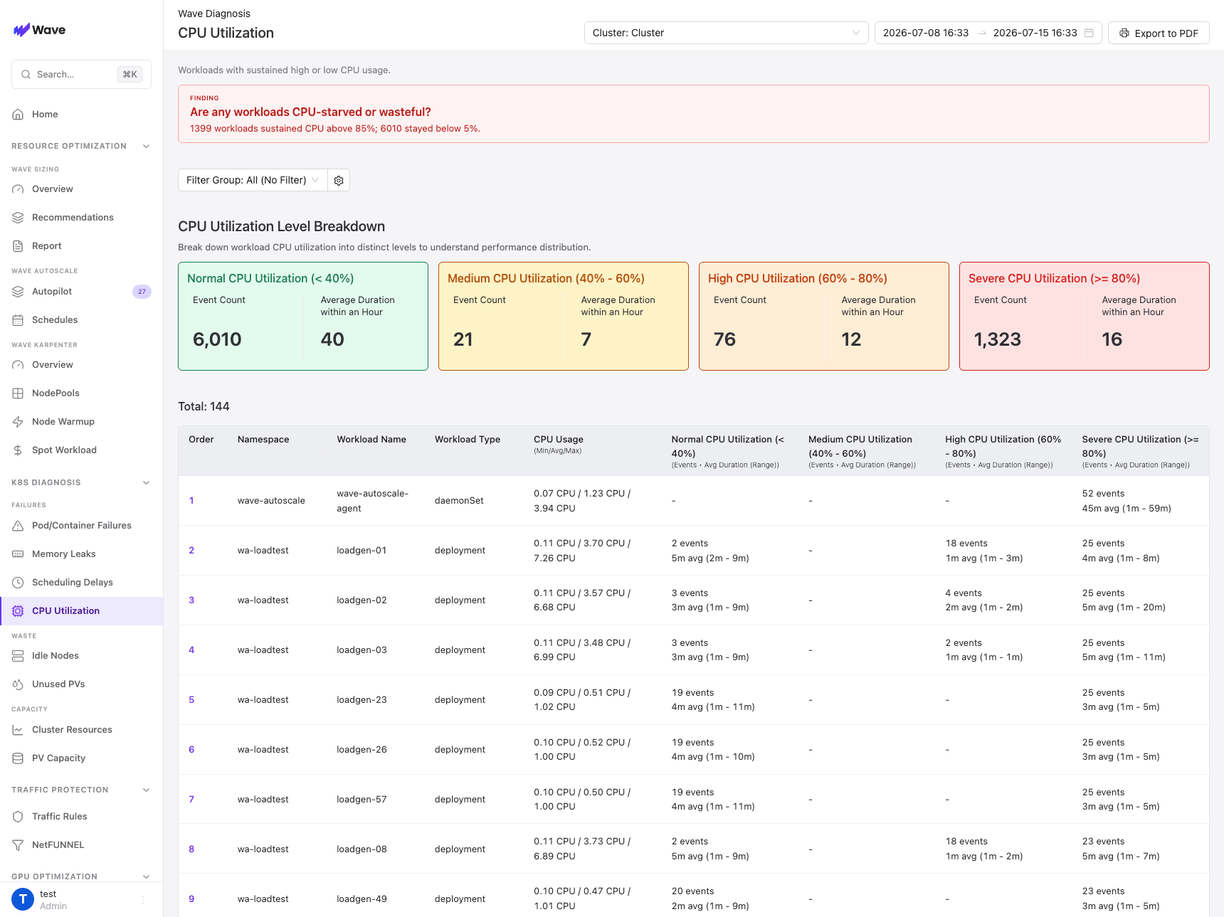
CPU Utilization Level Breakdown. Four cards sum the whole cluster for the selected range. Each shows the Event Count (how many times any workload entered that level) and the Average Duration within an Hour (how long those stays lasted), color-coded from green (Normal) to red (Severe), so you can read the cluster's overall CPU health in one line.
The workload table
Below the cards, one row per workload, ranked by severity so the worst offenders sit on top.
| Column | What it shows |
|---|---|
| Order | Severity rank; the highest-priority workloads sit at the top |
| Namespace | The namespace the workload runs in |
| Workload Name | The Deployment, StatefulSet, or DaemonSet name |
| Workload Type | The Kubernetes kind |
| CPU Usage (Min/Avg/Max) | CPU cores used, as a minimum, average, and maximum |
| Normal / Medium / High / Severe | One column per level, described below |
Each level cell reads X events, Ym avg (min to max): how many times the workload entered that level, the average length of each stay, and the range. A workload with most of its events in the Severe column is a sustained bottleneck; one that only spikes there briefly is intermittent, and often fine.
Filter Groups
The Filter Group dropdown (default All (No Filter)) narrows the analysis to a subset of workloads, and the gear icon beside it opens Filter Group management. Define a group with Kubernetes label conditions (operators like Equals, In, and Exists, combined with AND or OR) to slice by team, environment, or application tier. When a group is selected, the workloads that match its labels are aggregated into a single row, so you can read CPU behavior per logical grouping rather than per workload.
CPU is only one dimension
High CPU utilization is not always a problem. Batch jobs, ML training, and video encoding are supposed to run near 100%; that is efficient, not a bottleneck. The real signal of user impact is latency and error rate, not CPU alone. Use this analysis to prioritize which workloads to look at, then confirm with application metrics before you scale.
Use cases
Performance troubleshooting
Filter to Severe and High to find CPU-bottlenecked services in seconds instead of sweeping dashboards by hand, then confirm with latency and error rate before you act. This cuts the time to find the culprit from hours to minutes.
Horizontal scaling decisions
For stateless workloads stuck in Severe or High, put them on Autopilot (or add replicas manually) and watch them settle back to Medium or Normal. The classification tells you which workloads need it, so you scale on evidence rather than a guess.
Vertical right-sizing
Pair this with Smart Sizing: raise CPU requests for Severe and High workloads, and lower them for Normal (over-provisioned) ones. CPU Utilization prioritizes the list; Smart Sizing supplies the exact numbers.
Capacity planning
Track the level mix over time. A rising count of Severe and High workloads means plan node additions; a cluster dominated by Normal is well provisioned. Cross-reference Cluster Resource Forecast to see when the trend meets your capacity.
Related
- Wave Diagnosis Overview
- Autopilot: put Severe and High workloads on ML-driven horizontal scaling.
- Smart Sizing: right-size the CPU requests of Normal (over-provisioned) workloads.
- Cluster Resource Forecast: if Severe and High counts keep climbing, forecast when the cluster runs short.